The main aim of this practice exercise is to analyze another building or work of the architect in the PA.2, always from an architectural perspective.
Then I decided to analyze Chichu’s Art Museum, designed by Tadao Ando, due to its modern design and other features I’ll be emphasizing later on.
Before starting the analysis, I’ll introduce the building. It is placed in the japanese region of Naoshima and was finished in the year 2004. As we’ll see later, it’s mainly made out of concrete, which can be seen with the naked eye.
First of all, I’d like to put a frame around everything I’m going to explain, because there are so many features in contemporary architecture and the task may become infinite if I explained all of them. I’ll also say that all these elements will be analyzed through the use of examples of the part of the building that best reflects them, as the building acts as a unity and all features are involved in all the construction. So, these are the ones I consider are more important for the analysis of the construction:
- Symmetry (Balance)
- Movement
- Light
- Color and Texture
- Scale
- Contrast
- Proportion
Symmetry
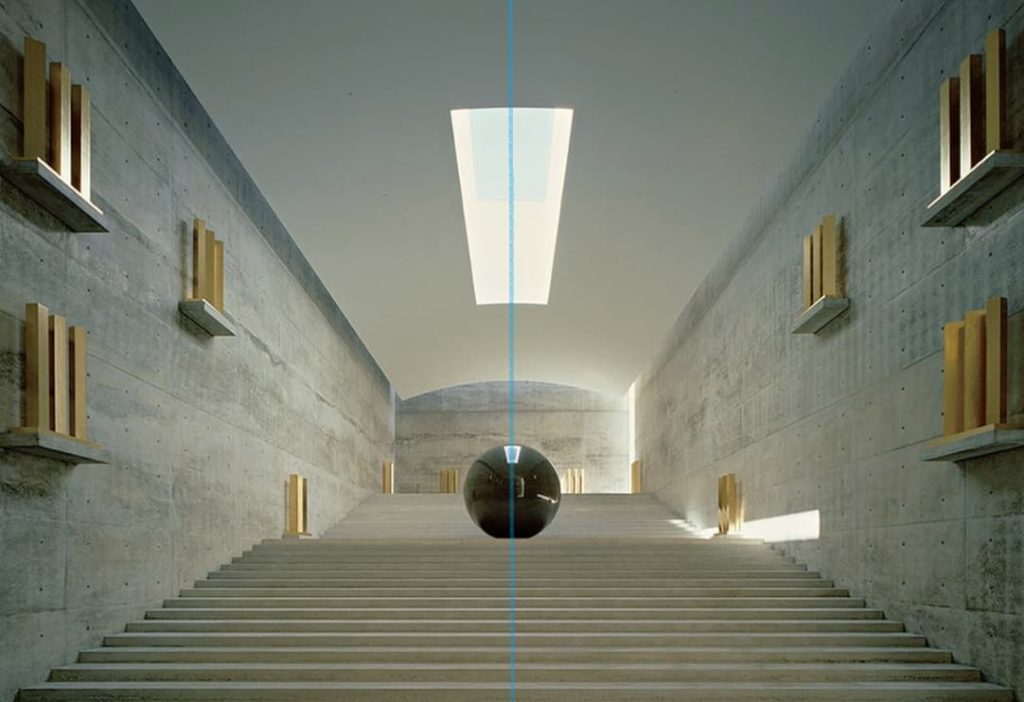
This is one of the rooms of the Art Museum, which normally contains the sculpture exhibition showed in the picture. This is one of the most famous parts of the building and has deserved the work of so many artist that have created a render of this space. In fact, it is difficult to find a real image of the room. As seen in the photo, the symmetry around the drawn axis (in blue) is almost perfect, leading to a visual balance. The distribution of the yellow elements around the sphere, combined with the skylight, creates this beautiful and almost unreal atmosphere.
Movement
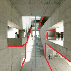
In this other picture we can visualize the differences between both sides of this corridor. It is curious, because there’s a symmetry (marked axis in blue) which is interrupted by these different elements which are unequal for both sides. From my point of view, this creates an effect of movement, as the forms and voids seem to recreate a complex of blocks which can be moved. Somehow it reminds me to some architecture elements in science and fantasy films such as the moving staircase of Harry Potter.
Light
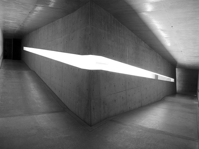
As said in other practices, Tadao Ando characterizes for the role of light in every single one of the projects he carries out. Therefore, he played with natural sunlight when designing all the parts of the Chichu Museum. The next images are of what I consider is a very clever design. Here, Tadao created a little gap in the wall leading to that interior opening, that apart of being a beautiful source of light, serves also as a handrail.
Contrast
There we have another view, this time from the outside, of this opening/rail. But this time we should talk about other aspect of the composition in architecture. This is the perfect example of contrast inside the building. The cobbles in contrast with the walls of concrete remind to the idea of a wall and its rubble, after any disaster that may have happened. Its not that clear, but it seems obvious that Ando wanted to provoke an emotion in the visitor by placing this kind of flooring, taking into account that other part of the building have grass and serve as a garden.
Color and Texture
There’s no that much to say about the color and Texture, as the building is almost only made out of concrete, but is in fact this what provides a unique essence. As seen before in the section about symmetry, the different artists that collaborate with this museum tend to work with the building too, adding strong colors to their projects. This makes Tadao’s choice the perfect option to create a museum, using the grey of concrete to focus the attention of the visitor into the exposition itself. The concrete texture is part of the composition too, as it creates this modern look which so many people love.
Scale
The scale is another factor in this building, as we can observe in the photo. It is an effect not created by the truly size of the building, but by the absence of ornamental elements in the walls, which make we have the illusion of huge amounts of concrete standing right in front of us, little humans.
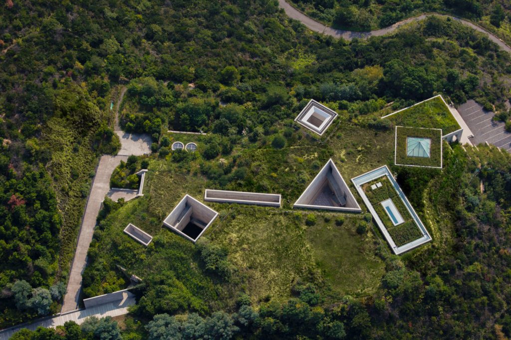
Proportion
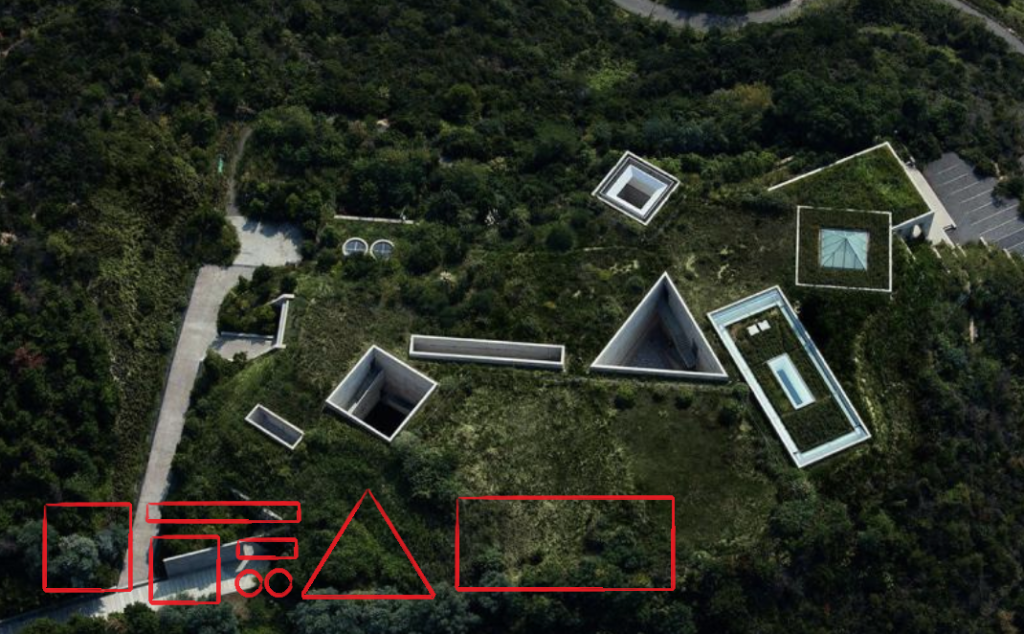
The last feature I’m going to talk about is the proportion, understanding it from a geometrical aspect. If we take a look of the building from the sky, we’ll be able to clearly differentiate the different geometrical 2D shapes (drawn separately in red). This elemental forms start at the top and are prolonged down to the floor creating those opening which are also a beautiful characteristic of the building. There’s visually that effect of movement we were talking before, achieved by displaying the forms in an unequally way.